
Central Station ReBrand
In the 3rd trimester of 2018, I was enrolled in “Typographic Systems”, in this class we undertook 1 long group project consisting of 3 different submissions across the 12 week timeline.
We were tasked with rebranding a public space to make it more appealing and easier to understand through use of branding, wayfinding, and signage, among other things. I was in a group of four. Each member of the group contributed significantly and we were able to communicate and ideate well, resulting in a final product we were all very happy with.
For the final 8 weeks and the last 2 submissions I was this leader. This role was new to me and I was quite nervous about taking it on. However, the rest of the group was very cooperative and talented so I ended up fitting as a leader better than I thought I would. I organised communication and led in class discussions, I delegated and worked hard to make sure everyones voice and Ideas were being heard and considered. For the First 2 submissions we earned high distinctions, with a distinction for the 3rd and final submission.
Below the 7 main aspects of our rebrand of Central Station in Sydney can be found. I directly designed the logo, colour scheme and all the merchandise. Not Included in this page is the 49 page presentation that I was responsible for designing


logo
I was responsible for designing the new logo. As a group we discussed what we wanted the new logo to represent and I then went and sketched designs. The final logo incorporates the main element of the aboriginal symbol for “meeting place”, this symbol
can be seen to the right of the logo.. This tied into our wish to have aboriginal influence all over our rebrand as well as served appropriately represents what Central station is. The logo is made up of a simple icon to make it easily identifiable with clear
and efficient text to further help clarity. The colour ties into our new colour scheme and makes use of calmer and cooler blues,
with a slight gradient to add some more movement.
(Grey background added to logo to improve visibility.)
Colour Scheme
The new colour scheme for Central station can be seen above. The new colours are bright and contrasting, allowing for
easy distinction across the station. The first 6 colours are used for the 6 train lines that directly pass through Central,
with the secondary 4 representing the train lines that don’t pass through Central.


maps
A map created to be used around the station can be seen on the left. The use of colour coding would allow for ease of use and make navigating the station simpler. The right shows a train line which has been coloured to match our new colour scheme.
Icons
The suite of Icons for use around the station are shown above. They use elements of hand drawn line work and dotted borders to tie Into Australia’s Indigenous history and background. These aboriginal elements combined with simple and universal Imagery makes for Iconography that Is easy to understand while still having an Australian character to them, helping them stand out.

Signage
Screens display which & when trains will be arriving. Once again colour coding has been brought Into use to make Information easy to understand. Coloured lines leading from the screens make It easier to find the platform you’d like to go to Is.
Above you can see signage that would be around the station. Ranging from signs for different platforms to more general signage used to Indicate where facilities or how far away certain platforms are. Like earlier aspects of the re-design, there’s a heavy use of colour coding, with simple & clear layouts.


Merchandise
Tote bag
The first example of merchandise can be seen above. A canvas tote bag with designs reminiscent of the rest of the Central station rebrand. These bags can be handed out to visitors of the station for free. These bags also have practical use and minimal
blatant branding so that people aren’t discouraged from taking advantage of the free merch.
We took a similar approach with the rest of the merchandise. We wanted products that would be appropriate to the new Central while also having a purpose. Additionally we wanted to make sure that the Central branding wasn’t blatant and off putting.
The rest of the merchandise can be seen below

Lanyard
The lanyard above serves as a way to have ease of access to your opal card. It features the new Central logo with an aboriginal Inspired curved line with the whole piece making use of the new colour scheme. “The New Central” Is located along the lanyard to help Indicate that this change In Imagery and branding marks a more efficient and helpful Central Station.


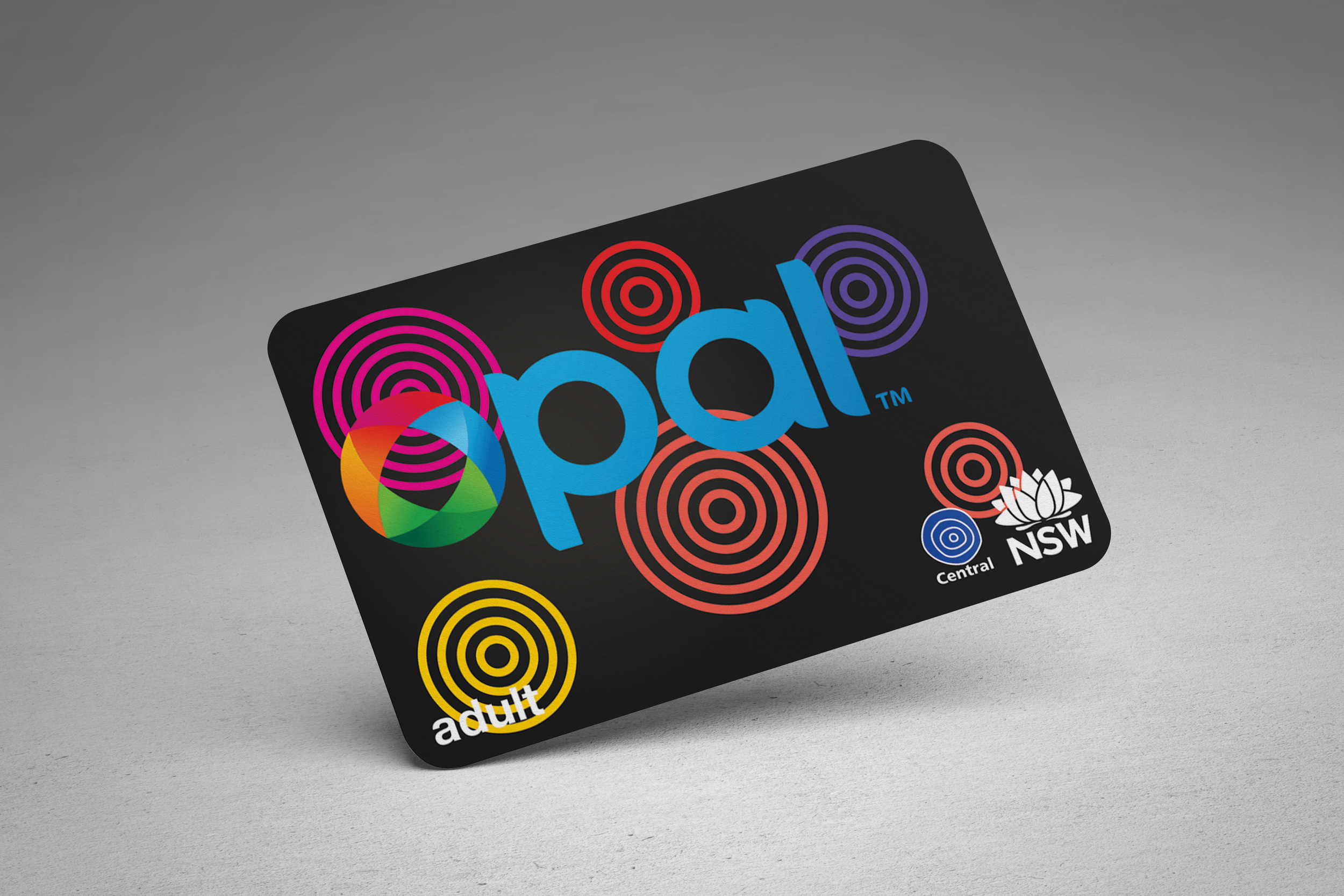
Alternate Opal Cards
These alternate Opal cards are much more lively than the current ones and make for a good way to spread the new branding.
The 4 new designs once again take Inspiration from Australia’s Aboriginal roots and mixing It with the bright new colour scheme.